A logo is one of the most important elements of a business’s branding. And none more so than with an agriculture business.
Certain colors and imagery denotes agriculture. By incorporating such recognizable features into a logo, it becomes instantly identifiable as an agriculture business to audiences.
LogoDesign, professional logo makers, provide tips on how to create agricultural logo designs. The infographic looks at the best types of logos for an agricultural business. Some of the best type of logos for agriculture ventures include:
Monogram Logos
These logos combine the initials of a brand into the design of the logo.
Wordmark Logos
Another font-type logo, which combines the brand’s name with a distinctive typeface.
Iconic Logos
Iconic logos use real-world objects that are easily recognized as an agricultural item, such as a farm or field.
Abstract Logos
These graphic-led logos represent a concept embodied by the agriculture business.
Mascot Logos
These logos use a mascot, animal, or person – real or fictional – to depict the brand.
Combination Mark
Combination mark logos combines words and picture using both a monogram and wordmark to represent an agriculture business.

Choosing the Right Font
Different fonts denote different messages. The choice of font for a logo is important in creating the right image and message for any business, including an agriculture business.
If, for example, an agriculture business is trying to create a serious, formal tone to establish trust and authority, they might want to opt for Serifs. Serifs is a traditional, classic font, which provides an authoritative and formal branding message.
By contrast, Sans-Serif is more informal, creating a modern, fun and creative feel, which could be more suitable for newer businesses.
Think About the Color

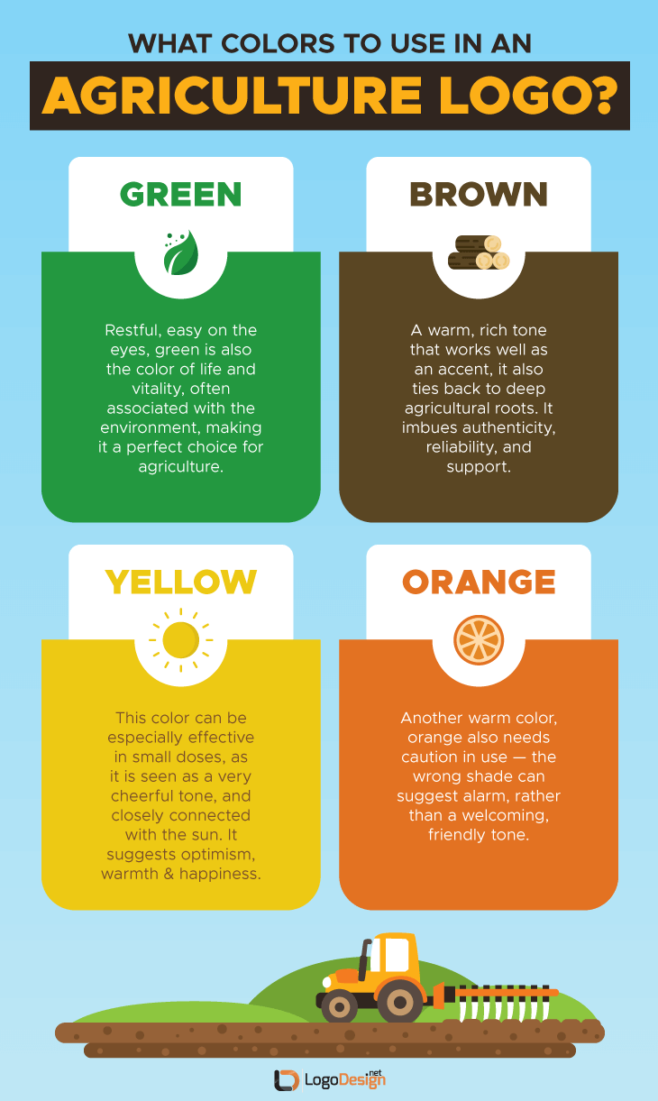
Being ‘at one’ with nature, agriculture is an inherently colorful industry. The choice of logo color is therefore significant and important. Green is an obvious choice for a logo for an agriculture business, denoting the environment and an aura of vitality.
Brown is another ‘safe’ agriculture color, recognizable as being ‘at one’ with nature. In psychological terms, brown also imbues reliability and authenticity.
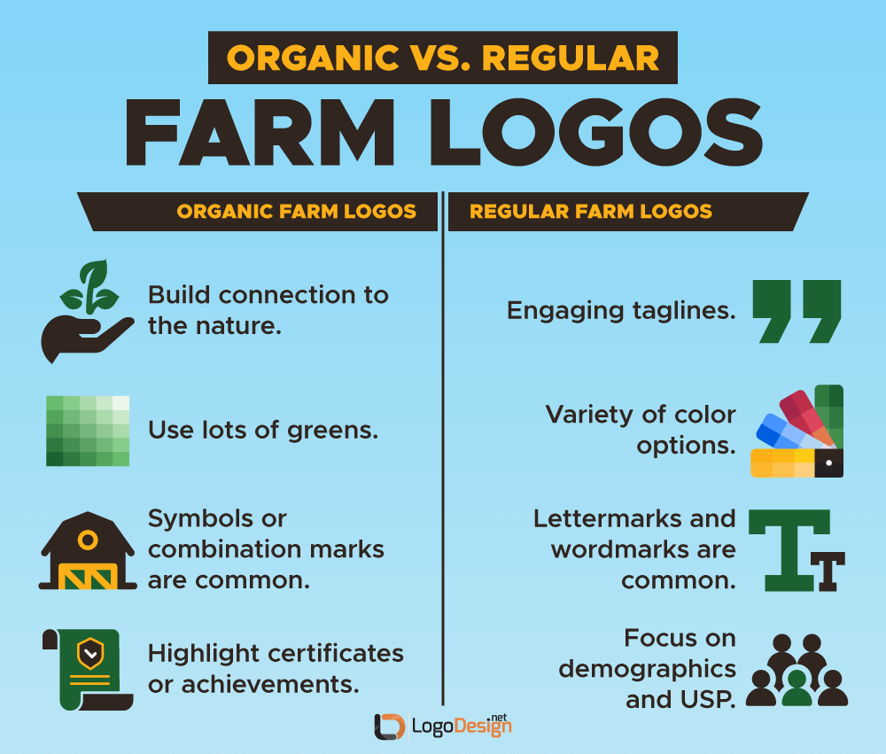
Organic Farm Logos

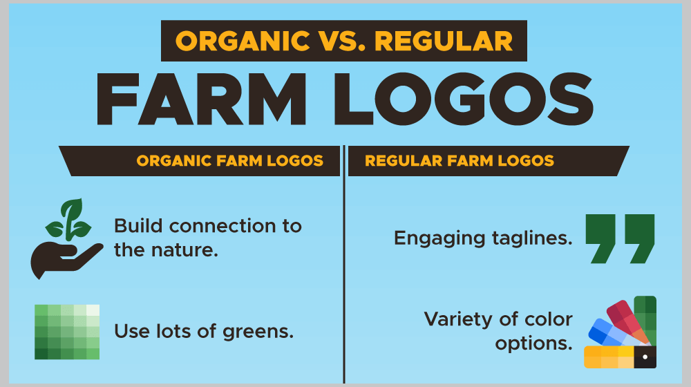
Organic is a buzzword in farming. For agriculture businesses that pride themselves on being organic, they might want to get this message across in their logo. Organicity can be achieved by making green the dominant color of the logo. The logo could showcase a connection to nature through the choice of imagery. The logo could also incorporate company achievements or certifications to prove it offers organic farming.
You might want to “think outside the box” somewhat and create a logo that doesn’t comply with conventional agriculture branding. Either way, your logo should reflect your agriculture business’s brand, personality, message and mission.
Images: LogoDesign.net
This article, “Tips for Creating a Logo for an Agriculture Business” was first published on Small Business Trends